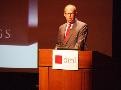
Pentagram partner, Michael Bierut closed the first day of Design at Scale, and did so with mastery and aplomb. He laid out the cliches of what designers supposedly like… and then neatly shot down each one, with a series of things he actually loves. Hugely entertaining and, as with all the best presentations, also educational. Here’s a brief recap of things Bierut truly loves about design:
1. Incredibly Short [Design] Briefs
When Robert Stern became the head of Yale School of Architecture, there was panic in the halls that a new reign of fusty neoclassicism dawned. Instead, when commissioning Bierut to work on a new identity for the school, Stern simply said “I just want to surprise people.” The result: an identity which never uses the same typeface twice. The only consistency, said Bierut, is “lack of consistency.” Bold, memorable, clever.
2. Briefs that are Filled with Paradox and Internal Contradiction
Bierut trotted out some of the classic contradictory desires clients can express when trying to commission a design. They want old and new; male and female; consistent and ever-changing; timeless and surprising. “A lot of designers hear this and roll their eyes,” he said. But he gets to thinking about a way to hit both ideas. He showed work for Saks Fifth Avenue, most recently designed by Bierut’s former boss, Massimo Vignelli and which he updated to include a world of vigorous modern abstraction that also nods to the heritage of the department store. (Read Logo A-Go-Go, a NYT story from 2007 with details of the project.)
3. Working on Things I Don’t Know Anything About
Bierut told the story of working on the Harley-Davidson museum, confessing that he himself is not much of a hardcore biker, having never actually sat on a motorbike before. But rather than let this be a cause for dismay, he instead got to play the role of reluctant spouse to his partner, Jim Bieber. In the process, the museum became a destination for more than just those obsessed with every nut and bolt of the Harley machine. An important nuance here: you might not know anything about a subject, but you have to have passion for discovery. Not knowing and not caring is a recipe for disaster.
4. Working with Impossible Restrictions
This is a common theme from designers, who often recoil in horror at the nightmare of an open brief calling on them to do whatever they like. Bierut talked of the challenge of putting a sign on Renzo Piano’s building for the New York Times. Times Square isn’t known for its subtlety, while the occupants of the NYT building wanted the fancy exterior of their fancy building to speak for itself. Bierut helped devise a cunning plan to hack up the Times’ logo into 923 pieces and then mount said pieces onto the rods already covering the building. Cunning and ingenious.
5. The Very First Idea
Another great story, of the challenge when Citibank merged with Travelers back in 1998. On the very first meeting of the first day they worked on the project, Bierut doodled the “T” of the word “Travelers” as an umbrella handle. Now, he said, you see pretty much that exact idea everywhere. “99% of the word was done on the first morning.” He also good-humoredly acknowledged that partner Paula Scher insists she did the fateful doodle.
6. When the Very First Idea Gets Thrown Away
Bierut told of his desperate attempts to get the Museum of Art and Design to see sense and buy into a logo he’d developed which involved the lettering “A+D.” Despite his valiant efforts, they weren’t buying it, and the eventual solution, a typeface that recalls the architecture of the original building while providing a legible alphabet to write in, was clearly superior. Stop digging, said Bierut. Accept you’re not always right.
7. Being Told Exactly What To Do
Another project that caused heartache and teeth gnashing was the New World Symphony in Miami, Florida. Asked to create a logo for the Frank Gehry building, Bierut came up with a series of solutions that the client absolutely hated. Having presented one idea, he recalled, “they were supposed to see it and ask ‘how can we thank you?’ Instead the question was 'is this supposed to make us feel nauseous?” In the end, the company founder Michael Tilson Thomas sent a series of his own scrawled ideas. Usually a cue for designers to feel uppity and upset that a client is trading on their toes, Bierut welcomed the input, and used it to come up with the final (gorgeous) solution. See a video of the process here.
[Image c/o DMI.]
yobmot liked this
stephengelmann reblogged this from thoughtyoushouldseethis-blog
hang-together-blog liked this
dadazzle-blog reblogged this from thoughtyoushouldseethis-blog
itswhatiwant liked this
artstainslife liked this
tobmgs reblogged this from thoughtyoushouldseethis-blog
artisthours reblogged this from thoughtyoushouldseethis-blog
typeworship liked this
overtheradar liked this
lucybabbit reblogged this from emancarrillo-blog
 poele-a-granule-blog reblogged this from thoughtyoushouldseethis-blog
 werbeplakate-gestalten-blog reblogged this from thoughtyoushouldseethis-blog
emancarrillo-blog reblogged this from thoughtyoushouldseethis-blog
josephlouistan reblogged this from thoughtyoushouldseethis-blog
designsojourn reblogged this from thoughtyoushouldseethis-blog
 harryrees-blog1-blog reblogged this from thoughtyoushouldseethis-blog
 randygregorydesign reblogged this from thoughtyoushouldseethis-blog
benjacob reblogged this from thoughtyoushouldseethis-blog
katiedaugherty liked this
 macdiva liked this
 lesemu reblogged this from thoughtyoushouldseethis-blog
clinttabone liked this
lotsadesignstuff reblogged this from brandingidentitydesign
darrengeraghty-blog liked this
brandingidentitydesign reblogged this from thoughtyoushouldseethis-blog
secondverse reblogged this from thoughtyoushouldseethis-blog
censemaking reblogged this from thoughtyoushouldseethis-blog
gridinoc liked this
thoughtyoushouldseethis-blog posted this
- Show more notes