The other day, TechCrunch writer Robin Wauters flagged a company, Boundary. “Nice logo,” he tweeted, and I agreed. So I got in touch with the company to get the story, and what I got provides, I think, a salient lesson in the process, application and reality of identity design in the digital era. Boundary’s Stephen Boak gave me the lowdown:
We were initially running with another concept that came from a T-shirt everybody liked [an appropriation of Peter Saville’s iconic design for Unknown Pleasures by Joy Division]. We actually released this and had it up on the website for a little while. After we released it I can remember saying to Ben [Black, company CEO] something like “I like it, but it’s not something I’d want to put on a T-shirt”, and I asked to take some time to work on other concepts.
I started sketching in my notebook. The scanned page here is one of three or four filled with ideas generated over a couple of days. I slapped this page down in front of Ben and asked what he thought. He said he didn’t like any of them. I remember REALLY liking the one on the top left because of that one continuous line between the letters – the wave. I pointed to it and Ben’s response was that it looked like one of those barbed-wire tattoos you see on the arms of guys at the Jersey Shore.“
I love this. Now, granted, the feedback came from the company CEO, and was shared with a trusted team member, but this is the kind of brutally honest feedback that designers have to learn to love. For design to flourish in the real world, it has to exist in multiple contexts, and somehow transcend the fact that everyone viewing it will see through the lens of their own biases and backgrounds. One man’s Jersey Shore tattoo is another’s sine wave is another’s elaborate type treatment. The trick for designers is to deal with this without ending up with something that has been neutered or diluted to the point of blandness. And a critical way to ensure that is for the designer to have a keen idea of his or her own intent. In this case, to reflect the meaning of the company name, a reference to the "boundary layer” of fluid dynamics which protects order from chaos. A pretty powerful concept for a design brief, in other words. Back to Boak:
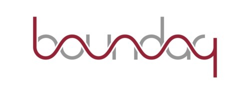
My first concept in Illustrator was pretty awful, as you can see. I did many more iterations varying line-weight and appearance of the letters. In these concepts, I’ve got gray on both sides of the red, but decided that the red line should be the “boundary” and that gray should only appear on one side for each letter.
When I got to something very close to what you see now, I asked everyone what they thought. There were six of us in the company at the time, so a team of systems and operations engineers gathered around the monitor and said “yeah, sure”. One of the guys on the team said he thought it was really clever – that made me proud. We all sat down and went back to work. It was up on the site later that day.
The logo’s not perfect. As Boak himself admitted, he’s “haunted” by the “ry” of the logo, which isn’t dead on. But the speed, iteration and flexibility of the company’s approach to its own identity design (including the lack of fireworks and rolled out bunting once it was agreed upon) provides a useful snapshot of the world in which we live. The first public beta of Boundary’s own product, “a platform for visualizing, exploring and troubleshooting data networks” is due to go live in the next month or so. I for one am curious to see it.
boundtosoil liked this
lozzasauce liked this
smalltownkids liked this
sketchyxsketcher liked this
 trench-shields-blog reblogged this from thoughtyoushouldseethis-blog
 - trench-shields-blog liked this
- packers-movers-chennai-blog reblogged this from thoughtyoushouldseethis-blog
quickselection reblogged this from thoughtyoushouldseethis-blog
refineunity liked this
christianmeyer liked this
thoughtyoushouldseethis-blog posted this
- Show more notes